Time Series Predictions on Sensor Networks
Time series predictions on bike station sensor networks in Toulouse. Statistical analysis, prediction models, and interactive visualizations.

Research on Time Series Predictions on Sensor Networks for Bike Stations in Toulouse
Introduction
As part of our Master 1 expertise project in statistics and probabilities, we studied statistical learning in a sensor network and its application to the reconstruction of the temporal dynamics of bike-sharing stations in Toulouse. Our study focused on the data from Toulouse covering the period from April 1, 2016, to September 27, 2016, with an observation made every hour. For our analyses and prediction models, we used the programming language Python, and all our results are presented in an interactive Dash application.
Project Repository:
As part of our project, we developed an interactive application using Dash. The application is designed to allow an in-depth and intuitive exploration of the bike station data from the city of Toulouse. It is divided into two main sections:
- Descriptive Statistics: To analyze the distribution and trends of the data.
- Predictions: To explore various prediction models and their performance.
Here is the link to our Dash application: Dash Application
Note: The application is hosted on Google Cloud Platform and can be accessed online. However, the application may be slow to load due to the size of the data and the complexity of the models, as well as resource limitations of the hosting.
Project Overview
Contextualization
The main objective of our study was to model and predict bike availability in the stations based on various temporal and geographical factors. We chose this subject due to the growing importance of bike-sharing systems in modern cities to promote sustainable mobility. Accurate prediction of bike availability is essential for optimizing station management and ensuring quality service to users.
Data Overview
The data used for our analysis was divided into three main CSV files:
| File | Description |
|---|---|
| coordinates_toulouse.csv | Contains the names of the stations in Toulouse as well as their geographical coordinates (latitude and longitude). |
| distance_toulouse.csv | Represents a matrix of distances (as the crow flies) between the different bike stations. |
| X_hour_toulouse.csv | Hourly observations of the proportion of bikes available at the various stations. Each row represents an hourly observation over approximately six months. There is one observation per hour for each station. |
These files were provided by our project supervisor and were used in the subsequent analysis and prediction phases of our study.
Statistical Data Analysis
Distribution of Bike Stations
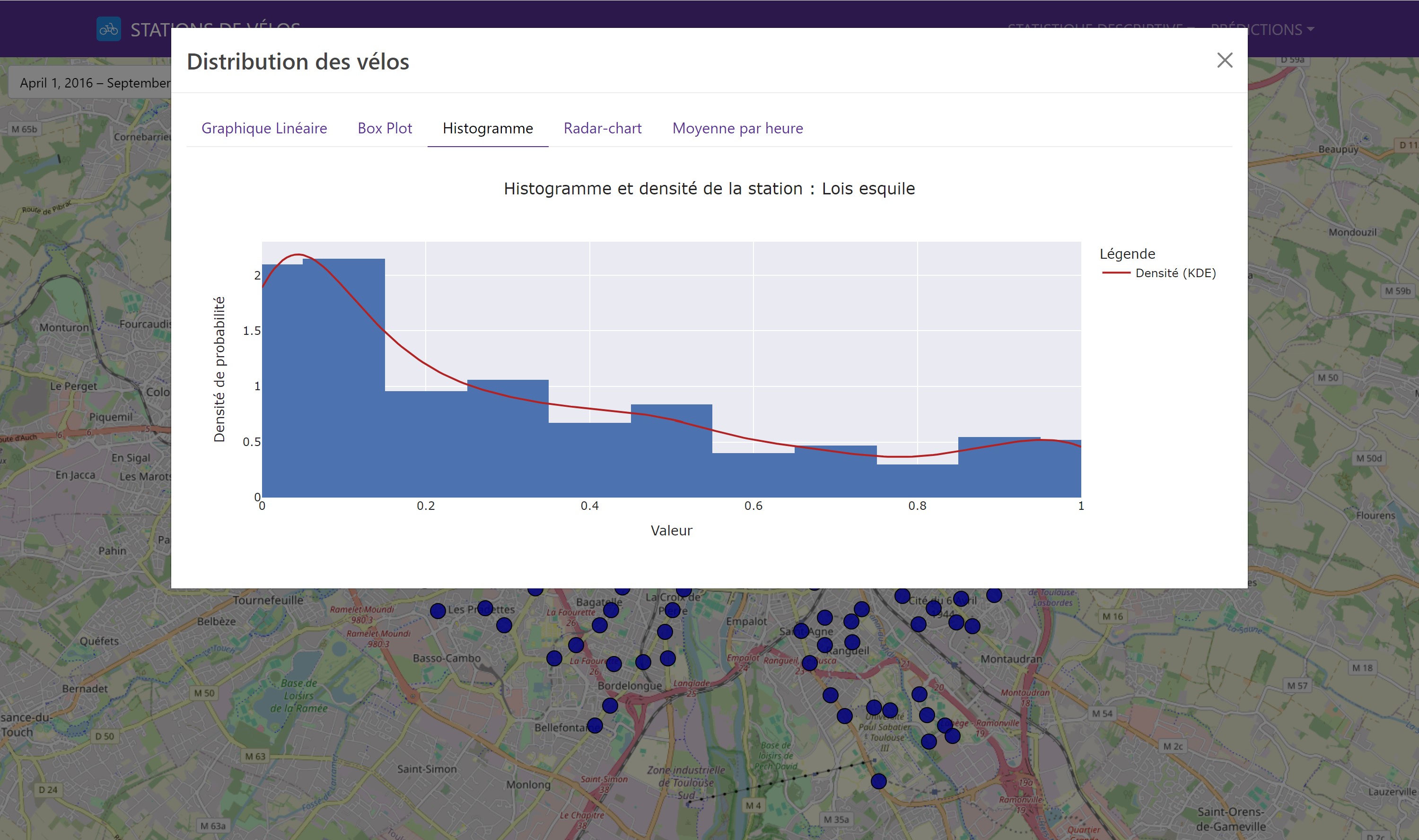
We began with a descriptive analysis of the data to understand the distribution and variability of available bikes. This initial step is crucial for detecting general trends and potential anomalies. The visual tools used included box plots and histograms, which revealed that stations located in the city center were, on average, busier than those in the outskirts.
In our Dash application, it is possible to select a station to view the various distribution graphs.
Here is an example of a bike station distribution graph:
Correlation Analysis
The correlation analysis between stations was conducted using the Pearson correlation coefficient. The goal of this analysis was to determine the linear relationships between the availabilities of the different stations. We found that stations geographically close to each other often had positive correlations, indicating similar behavior in terms of bike availability.
Here is an example with our interactive correlation matrix:
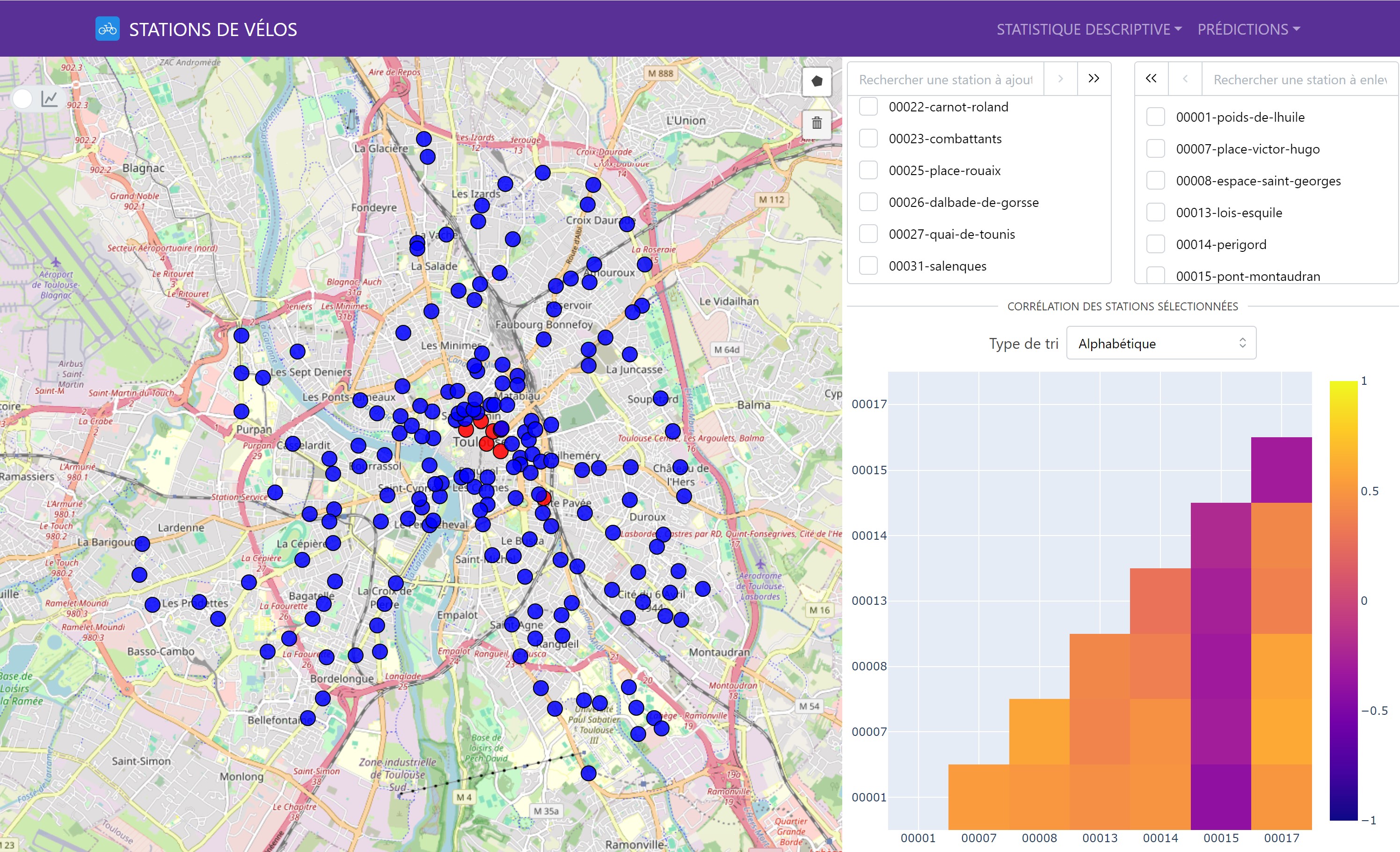
It is possible to select multiple stations to visualize the correlations between them.
There is also an interactive map to visualize the correlations of one station with the other bike stations in a geographical manner. Simply click on a station to see its correlations with the other stations.
Principal Component Analysis (PCA)
Principal Component Analysis (PCA) was used to identify the main temporal trends. This technique allowed us to capture the most significant variations in the data and visualize the relationships between the stations. The PCA results showed that the first two principal components explained more than 90% of the variance in the data, indicating a strong underlying structure.
Theory behind PCA
Principal Component Analysis (PCA) is a statistical technique used to reduce the dimensionality of a dataset while retaining as much information as possible. It transforms the original variables into a new set of variables called principal components, which are linear combinations of the original variables.
Data Standardization: To prevent large-scale variables from dominating others, the data is standardized (centered and scaled): \(z_{ij} = \frac{x_{ij} - \bar{x}_j}{s_j}\) where $ x_{ij} $ is the value of the $ i $-th observation for the $ j $-th variable, $ \bar{x}_j $ is the mean of the $ j $-th variable, and $ s_j $ is the standard deviation of the $ j $-th variable.
Covariance Matrix Calculation: The covariance matrix $ \mathbf{C} $ is calculated from the standardized data:
\(\mathbf{C} = \frac{1}{n-1} \mathbf{Z}^T \mathbf{Z}\) where $ \mathbf{Z} $ is the matrix of standardized data.Eigenvalue and Eigenvector Calculation: The eigenvalues $ \lambda $ and eigenvectors $ \mathbf{v} $ of the covariance matrix $ \mathbf{C} $ are calculated to obtain the principal components:
\(\mathbf{C} \mathbf{v} = \lambda \mathbf{v}\)Selecting Principal Components: The eigenvectors associated with the largest eigenvalues are selected as the principal components. The eigenvalues represent the amount of variance explained by each principal component.
Projecting the Data: The standardized data is projected onto the principal components to obtain new coordinates:
\(\mathbf{Y} = \mathbf{Z} \mathbf{V}\) where $ \mathbf{Y} $ is the matrix of projected data and $ \mathbf{V} $ is the matrix of eigenvectors.
PCA reduces the dimensionality of the data by retaining the principal components that explain most of the total variance. This technique is widely used in data analysis, machine learning, and data visualization.
We used Principal Component Analysis (PCA) to reduce the dimensionality of the data while retaining the essential information. PCA helped identify the main factors influencing data variability and allowed us to reconstruct the hourly station curves, capturing the essential daily variations. The PCA results showed that the first two components explained more than 90% of the variance in the data.
Bike Station Activity Prediction
Prediction Objectives
Our predictions focused on two main horizons:
- Short-term prediction: Estimating station activity for the next day, useful for managing daily demand fluctuations.
- Medium-term prediction: Forecasting weekly station activity, essential for strategic planning and optimal resource redistribution.
Model Training Methodology
To train our models, we used 70% of the available data, covering the period from April 1, 2016, to August 4, 2016. We extracted temporal features from the dates to create additional variables such as the hour, day of the week, and weekend and Sunday indicators. This method captures seasonal patterns and recurring cycles, thus improving prediction accuracy.
gantt
    title Training and Testing Periods
    dateFormat  YYYY-MM-DD
    axisFormat  %Y-%m-%d
    section Data
    Training :a1, 2016-04-01, 2016-08-03
    Test         :a2, 2016-08-04, 2016-09-27
Evaluation Metrics
We evaluated the performance of the models using two main metrics:
- Mean Absolute Error (MAE): Measures the average absolute difference between predicted and actual values.
- Mean Squared Error (MSE): Penalizes larger errors more severely, which is crucial for the strategic management of bike stations.
Theory behind MAE and MSE
Mean Absolute Error (MAE) is an evaluation metric that measures the average absolute difference between actual and predicted values. It is calculated by taking the mean of the absolute values of individual errors. The formula for MAE is:
\[MAE = \frac{1}{n} \sum_{i=1}^{n} |y_i - \hat{y}_i|\]where $y_i$ is the actual value, $\hat{y}_i$ is the predicted value, and $n$ is the total number of observations.
Mean Squared Error (MSE) is an evaluation metric that measures the average of the squared errors. It penalizes larger errors more severely by squaring the differences. The formula for MSE is:
\[MSE = \frac{1}{n} \sum_{i=1}^{n} (y_i - \hat{y}_i)^2\]where $y_i$ is the actual value, $\hat{y}_i$ is the predicted value, and $n$ is the total number of observations.
Description of Prediction Models
- Description:
- Prediction based on hourly averages from historical data.
- Advantages:
- Simplicity and fast implementation.
- Disadvantages:
- Does not capture fine variations and may lack precision for short-term predictions.
- Description:
- Use of principal components to predict bike availability.
- Advantages:
- Dimensionality reduction, better capture of main trends.
- Disadvantages:
- Increased complexity in result interpretation.
- Description:
- Prediction using several explanatory variables.
- Advantages:
- Easy to interpret and implement.
- Disadvantages:
- Sensitive to outliers.
- Requires data preprocessing.
- Description:
- Use of decision trees for prediction.
- Advantages:
- Ability to handle large amounts of data and capture complex interactions between variables.
- Disadvantages:
- High computation time and complexity in interpretation.
- Description:
- Boosting algorithm to improve prediction accuracy.
- Advantages:
- High performance, efficient handling of missing values and complex interactions.
- Disadvantages:
- Complexity in implementation and hyperparameter tuning.
- Description:
- Integration of PCA with XGBoost for better performance.
- Advantages:
- Increased accuracy through dimensionality reduction.
- Disadvantages:
- Increased overall model complexity.
Implementation of Models in Python
We implemented our baseline model for time series predictions using Python and the scikit-learn library. The prediction models inherit from the abstract class ForecastModel, which defines the common methods and attributes for all models. Each prediction model implements the train and predict methods specific to its algorithm.
Python code for the ForecastModel class
1
2
3
4
5
6
7
8
9
10
11
12
13
14
15
16
17
18
19
20
21
22
23
24
25
26
27
28
29
30
31
32
33
34
35
36
37
38
39
40
41
42
43
44
45
46
47
48
49
50
51
52
53
54
55
56
57
58
59
60
61
62
63
64
65
66
67
import pandas as pd
import joblib
from sklearn.metrics import mean_squared_error, mean_absolute_error
from typing import Self, Any
from data.city.load_cities import City
from data.data import get_interpolated_indices
from abc import ABC, abstractmethod

PATH_MODEL: str = './data/prediction/methods/'

class ForecastModel(ABC):
    name = 'BaseModel'

    def __init__(self: Self, city: City, train_size: float=0.7) -> None:
        self.city = city
        self.train_size = train_size

        self.df_dataset = city.df_hours.copy()
        self.df_dataset = self.df_dataset.set_index('date')

        self.split_data()

    def split_data(self: Self) -> None:
        split_point = int(len(self.city.df_hours) * self.train_size)
        self.train_dataset = self.df_dataset.iloc[:split_point]
        self.test_dataset = self.df_dataset.iloc[split_point:]

    def save_model(self: Self, model: Any, station_name: str, compress: int=3) -> None:
        joblib.dump(model, f'{PATH_MODEL}{self.name}/{station_name}.pkl', compress=compress)

    def load_model(self: Self, station_name: str) -> Any:
        return joblib.load(f'{PATH_MODEL}{self.name}/{station_name}.pkl')

    @abstractmethod
    def train(self: Self) -> None:
        pass

    @abstractmethod
    def predict(self: Self, selected_station: str, data: pd.Series, forecast_length: int) -> pd.Series: # DOIT RETOURNER UNE SERIE !
        pass

    @staticmethod
    def create_features_from_date(date_serie: pd.Series) -> pd.DataFrame:
        df_X = pd.DataFrame()
        df_X['hour'] = date_serie.dt.hour.astype('uint8')
        df_X['day_of_week'] = date_serie.dt.dayofweek.astype('uint8')
        df_X['day_of_month'] = date_serie.dt.day.astype('uint8')
        df_X['is_weekend'] = (date_serie.dt.dayofweek >= 5).astype('uint8')
        df_X['is_sunday'] = (date_serie.dt.dayofweek == 6).astype('uint8')
        return df_X

    @staticmethod
    def get_DatetimeIndex_forecasting(serie: pd.Series, prediction_length: int) -> pd.DatetimeIndex:
        return pd.date_range(serie.index[-1], periods=prediction_length, freq='1h', inclusive='left')

    @staticmethod
    def get_metrics(predicted: pd.Series, reality: pd.Series, metrics: str='all', exclude_interpolation_weights: bool=True) -> dict[str, float]:
        sample_weight = pd.Series(1, reality.index)
        if exclude_interpolation_weights:
            sample_weight[get_interpolated_indices(reality)] = 0

        metrics_dict: dict[str, float] = {}
        if metrics == 'all' or metrics == 'mse':
            metrics_dict['mse'] = mean_squared_error(reality, predicted, sample_weight=sample_weight)
        if metrics == 'all' or metrics == 'mae':
            metrics_dict['mae'] = mean_absolute_error(reality, predicted, sample_weight=sample_weight)
        return metrics_dict
This is the base model we used to implement our different prediction models. It is an abstract class ForecastModel that defines the common methods and attributes for all models. Each prediction model inherits from this class and implements the train and predict methods specific to its algorithm.
Python code for the XGBoost model
1
2
3
4
5
6
7
8
9
10
11
12
13
14
15
16
17
18
19
20
21
22
23
24
25
26
27
28
29
30
31
32
33
34
35
36
37
38
39
40
41
42
43
44
45
46
47
48
49
50
import pandas as pd
from xgboost import XGBRegressor
from os import makedirs
from typing import Self

from data.city.load_cities import City
from data.data import get_interpolated_indices
from data.prediction.forecast_model import ForecastModel, PATH_MODEL

class XGBoost(ForecastModel):
    name = 'XGBoost'

    def __init__(self: Self, city: City, train_size: float = 0.7) -> None:
        super().__init__(city, train_size)
        makedirs(f'{PATH_MODEL}{self.name}', exist_ok=True)
        self.models = {}

    def train(self: Self) -> None:
        df = self.train_dataset.copy()

        for station in df.columns:
            try:
                current_model = self.load_model(station)
            except FileNotFoundError:
                # Exclure les indices interpolés pour la station
                interpolated_indices = get_interpolated_indices(df[station], output_type='mask')
                df_filtered = df.drop(index=interpolated_indices)

                df_X = ForecastModel.create_features_from_date(df_filtered.index.to_series())
                df_y = df_filtered[station]

                current_model = XGBRegressor(n_estimators=70, max_depth=9, learning_rate=0.08)
                current_model.fit(df_X, df_y)

                self.save_model(current_model, station)

            self.models[station] = current_model

    def predict(self: Self, selected_station: str, data: pd.Series, forecast_length: int) -> pd.Series:
        if selected_station not in self.models:
            raise ValueError(f'Model for station {selected_station} not found.')

        data_index = ForecastModel.get_DatetimeIndex_forecasting(data, forecast_length)
        df_X_future = ForecastModel.create_features_from_date(data_index.to_series())

        model = self.models[selected_station]
        predictions = model.predict(df_X_future)
        predictions = predictions.clip(0, 1)

        return pd.Series(predictions, index=data_index, name=self.name)
Here is the implementation of the XGBoost model that inherits from the ForecastModel class. This model uses the XGBoost boosting algorithm to improve prediction accuracy. It is trained on historical data and used to predict bike availability.
Thanks to this structure, we were able to easily implement different prediction models using various algorithms while maintaining consistency in the interface and methods of each model.
Results and Visualizations
It is possible to visualize the results of our predictions in our Dash application. Here is an example of a prediction graph over one week for a bike station:
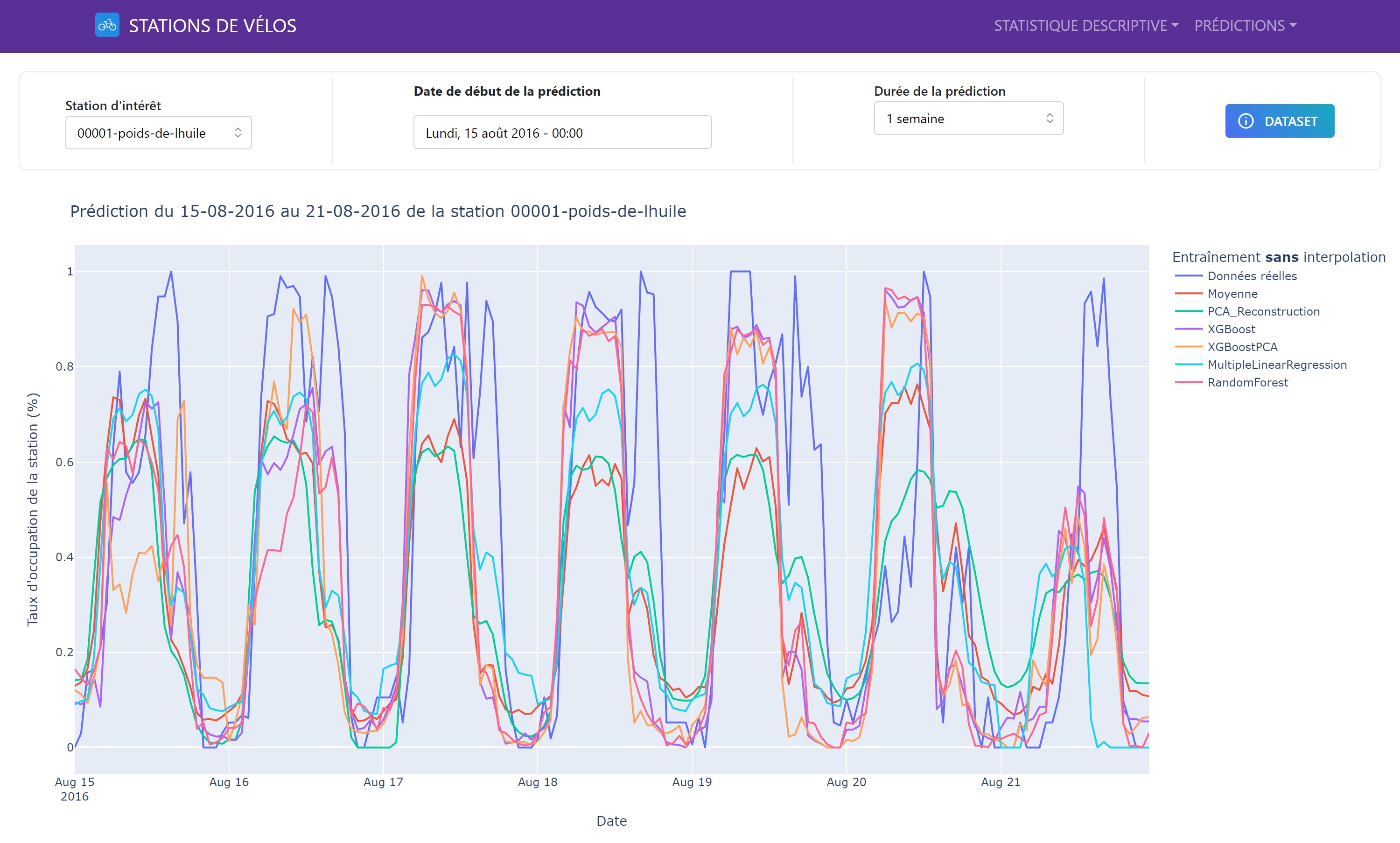
The graph shows the actual and predicted values of bike availability for a given station over a one-week period. The predictions are based on the models we trained and evaluated. The graph is interactive, allowing users to zoom in, pan, and view the prediction details. It is also possible to change the prediction start date to explore different time periods.
Model Comparison
Overall Performance
The performance of the models was compared in terms of MAE and MSE to identify the best performers. The results showed that some models were more suitable for short-term predictions, while others performed better for medium-term predictions.
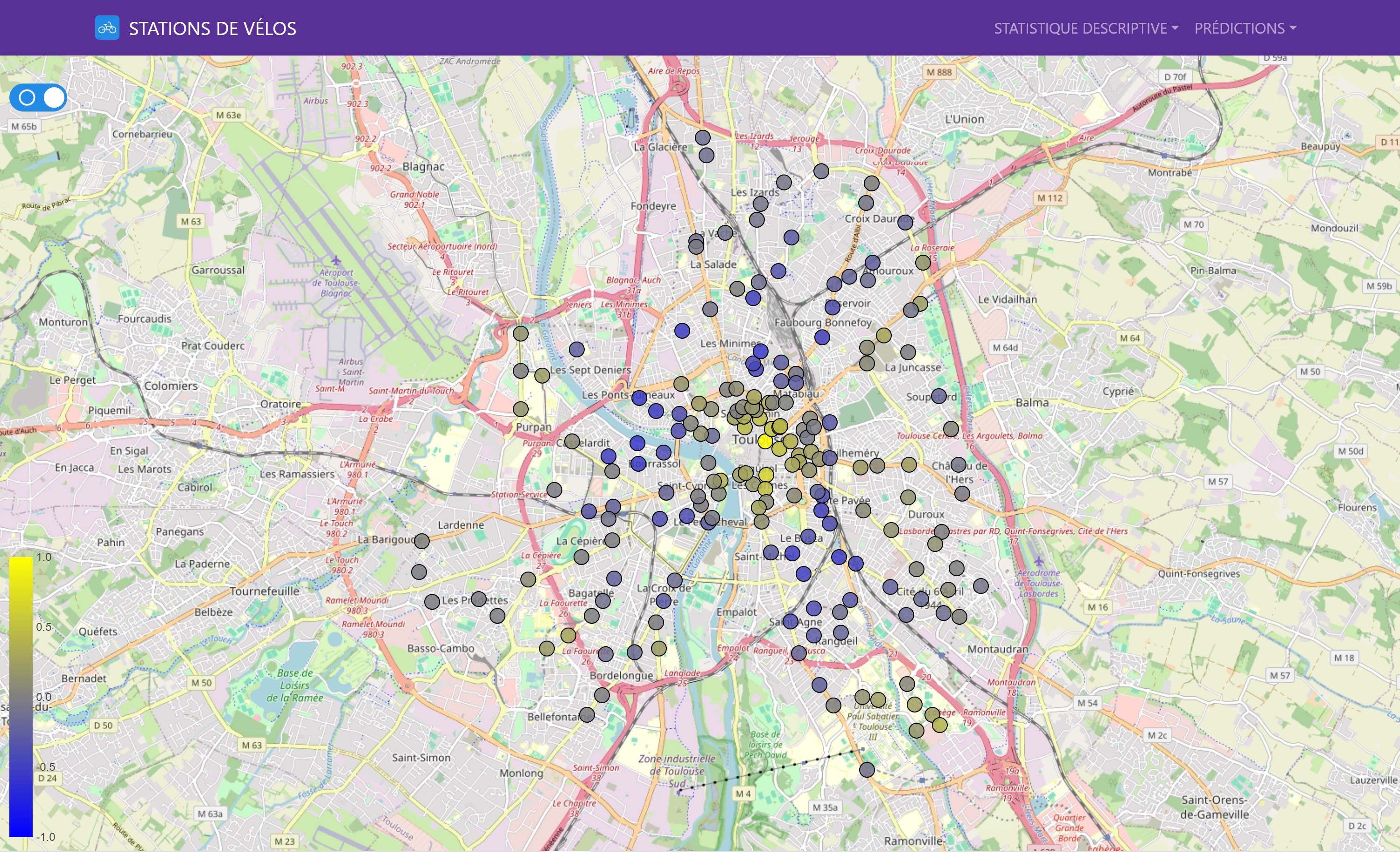
Geographical Analysis of Metrics
We also evaluated the models’ performance on a geographical basis, allowing us to visualize local variations and identify the areas where predictions were most accurate.
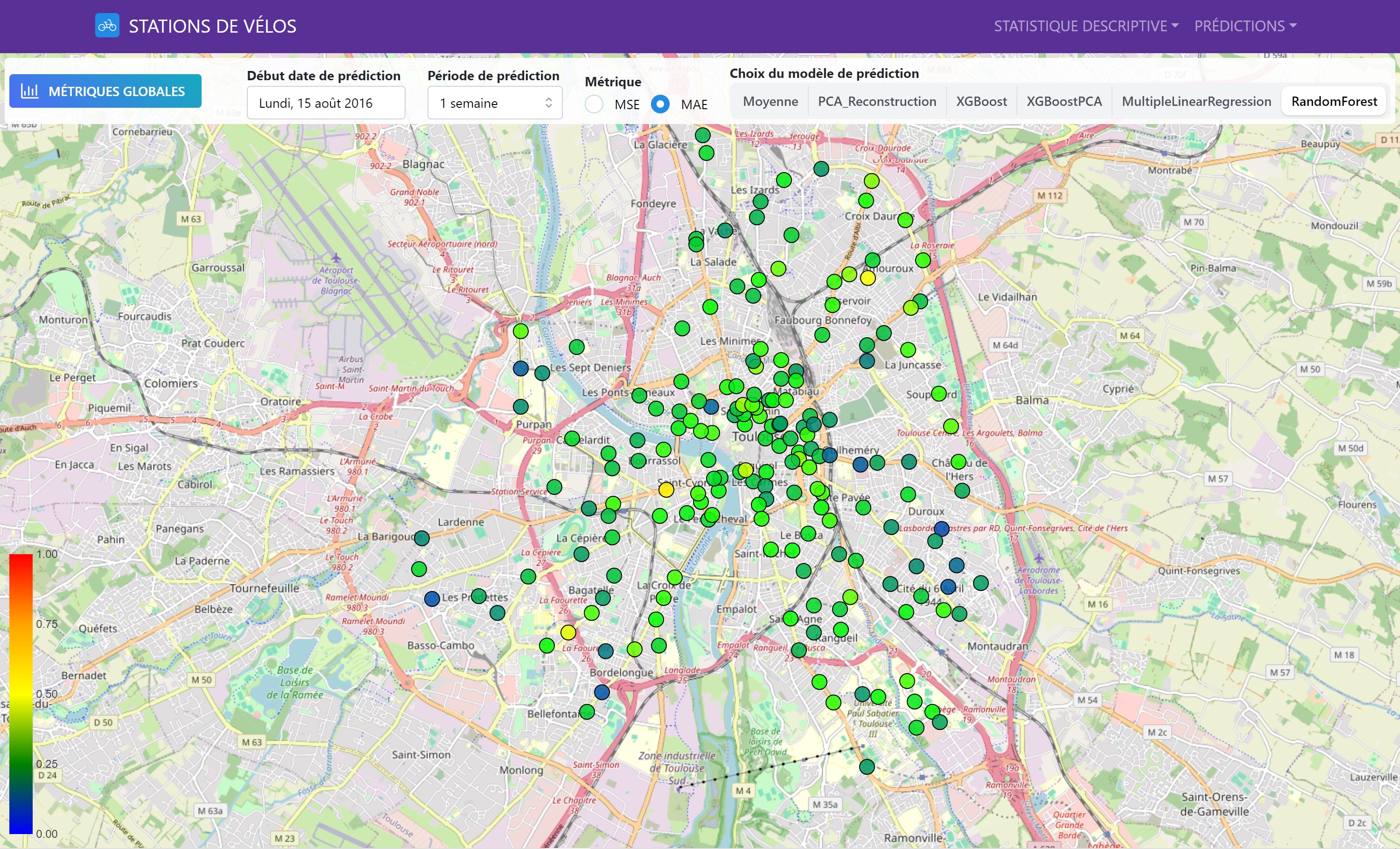
This interactive map shows the performance of different prediction models for each bike station. The colors indicate MAE and MSE values (users can select the metric they wish to visualize), allowing for a comparison of model performance across the entire station network.
Conclusion and Observations
Statistical Data Analysis
The first part of the project provided insights into the structure and trends of the data, laying a solid foundation for the prediction models. The correlation analysis and PCA revealed interesting relationships between stations and allowed us to capture the essential temporal variations. These analyses provided valuable information for modeling bike station activities.
Predictions and Model Comparison
The second part demonstrated that certain models offer better performance depending on the chosen prediction horizon. Short-term predictions benefit from fast and flexible models, while medium-term predictions require models capable of capturing broader trends. The geographical performance analysis showed significant variations in predictions, highlighting the importance of models adapted to each station.
Reflections and Improvement Opportunities
The results of our study suggest several areas for improvement, including the integration of new data sources, such as weather data or local event data, to refine the prediction models and increase their accuracy. We also considered exploring more advanced methods for time series forecasting, such as lagging features or the sliding window method.